Enhance your Designs with Accessibility Annotations
Accessibility is a joint project. To ensure that a website is easy to use for all users, accessibility should be considered throughout the entire development process. How can designers best contribute?
As a web developer and requirements engineer, I work closely with UI/UX designers. Based on the requirements, they develop designs and prototypes for the user interface, which developers later implement. This work is often very visually dominated: Which colors are used? How do we best take the customer’s corporate identity into account?

Photo: © Amina Filkins / pexels.com
When designers tackle accessibility, they often think of the use of color and sufficient contrast ratios. But designs can do even more: accessibility annotations convey important information about the structure and semantics of the website.
The A11y Annotation Kit for Figma
There are various programs for creating prototypes. My colleagues like to work with Figma, a collaborative platform for UI/UX design.
To document accessibility considerations there, designers can define suitable elements themselves or work with ready-made libraries such as the A11y Annotation Kit. This offers a wide range of tools to mark up semantic information in the design. Let’s take a closer look at a few of them.
Mark up Headings
Sighted users usually scan a website for headings to find what they are looking for. Headings are also of central importance for blind and visually impaired users: According to the latest survey by WebAIM, 9 out of 10 screen reader users say that meaningful heading levels are very or somewhat useful for them.
Headings must be marked up semantically so that screen readers can recognize them as headings. On websites, this is done with
the HTML tags h1 to h6 . Users can then use keyboard shortcuts to jump from
heading to heading, for example, and thus get a quick overview.
Designers should consider as early as possible how the content of a page can be meaningfully structured with headings. In the final design, all headings and their level (1 to 6) should be annotated. Here’s an example:
Screenshot: © Alexander Lehner
Two questions will constantly accompany you: What makes a headline a headline? Which headline hierarchy makes sense? To make your life a little easier, here are a few learnings and tips:
- Headings structure the content of the page: A heading introduces a new section of content and should describe it. Large font, bold print or a separate line do not automatically turn a text into a heading!
- Never skip a heading level! The most important heading should be marked as
h1, followed byh2,h3, etc. Headings with the same or higher rank start a new section. Headings with a lower rank start new subsections. - Separate styling and semantics: The visual appearance of a heading should never determine which heading level
is used! My advice: Define your own heading classes such
as
heading-sm,heading-md,heading-lg, etc. This allows you to style headings regardless of their position in the hierarchy. - In some cases, a visually hidden heading can also make sense in order to improve the page structure.
- Be creative! A perfect heading structure is hard work. Make a draft. Get feedback from outside. Refine your designs step by step. No one is born a master 😉
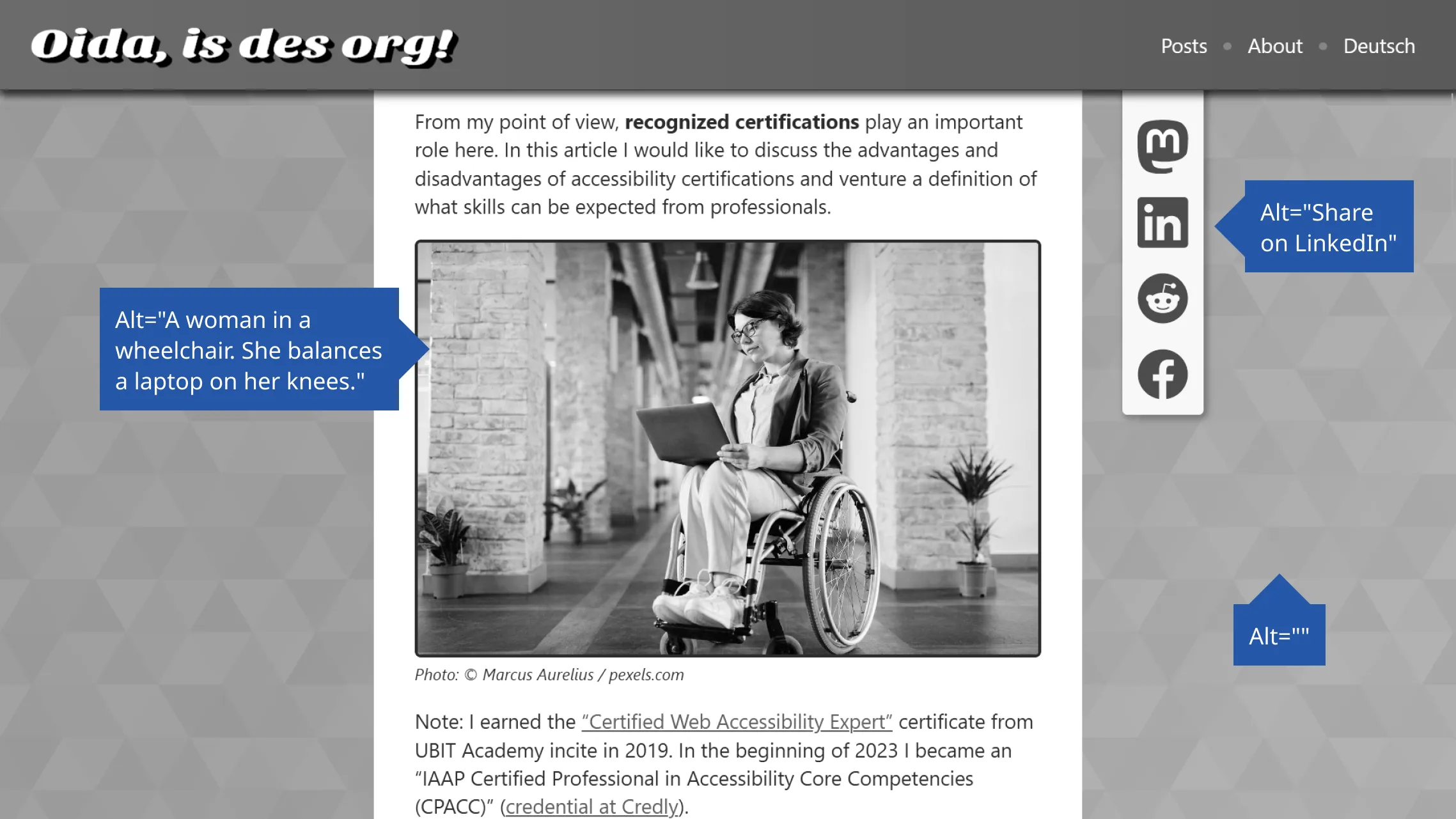
Alternative Text for Images
Missing or poor alternative text is one of the most common barriers on websites. According to the WebAIM Million 2023 study, over one third of the images on popular websites have missing, questionable, or repetitive alternative text.
Design prototypes should therefore define alternative texts for image content so that visually conveyed information is also accessible for screen reader users. You should consider the following points:
- Functional images: If a button or link only contains an image or icon, the alternative text must describe the purpose of the element.
- Informative images: These are images that convey relevant information. Here, the design should specify a concrete alternative text or at least communicate that a meaningful alternative text must be defined.
- Decorative images: If images are only intended to embellish the page, then they must be hidden from assistive
technologies. The accessibility annotation can represent this with
alt="".
Screenshot: © Alexander Lehner
You can find more information and some negative examples in my article “A Picture Says More Than a 1000 Words – Unless You’re Blind!”.
Button or Link?
Links are underlined. Buttons are clickable boxes. Aren’t they? 🤔
Visually, links and buttons are often not clearly distinguishable from each other. In some designs, links look like classic buttons, and vice versa. This is usually not a problem for sighted users: they only need to understand that these elements are interactive.
However, the semantic role of the elements is particularly important for assistive technologies. Depending on whether the screen reader announces an element as a link or a button, users expect different behavior:
- Links navigate to a new resource, e.g. another website or another section on the same page. You leave the current context.
- Buttons, on the other hand, trigger an action in the same context, e.g. a pop-up menu or playing a video.
This means that the appearance is secondary. The function of the element is crucial. I recommend you read the article “Links vs. Buttons in Modern Web Applications”, which delves deeper into the topic.
Dear designers: Mark links and buttons according to their function. And please add a legend to your design that tells developers
to use native elements for this. So a for links and button for buttons. Your
users will love you for it! 🤩
Posted on