CSS tweaks for better visibility in Forced Colors Mode
High contrast between text and its background benefits everyone. Be it people with low vision or anyone looking at the screen in the glaring sun. That's why WCAG has minimum requirements for contrast of text and UI components.
For some visually impaired users, this is not enough. They need specific color themes with high contrast to increase text legibility and improve readability. Assistive technology like High Contrast Mode on Windows can actively change a website's colors to accomodate users with limited vision.
 Photo: © Steve Johnson / pexels.com
I'll show you how forced colors mode works for websites and how to improve the user experience with some CSS tweaks.
How does Forced Colors Mode work?
Forced colors mode is a cross-browser standard defined in CSS Color Adjustment Module Level 1. Operating systems should provide built-in color themes and allow users to customize their own themes.
The specification states:
When forced colors mode is active (...), colors on the element are force-adjusted to the user’s preferred color palette.
This means that color values are replaced with system colors to match the defined theme. Among the affected CSS properties are:
colorbackground-colorborder-coloroutline-colorfill
Other properties like box-shadow and text-shadow are set
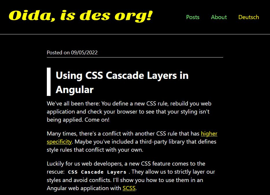
to none. To give you an example, this is what my blog looks like in forced colors
mode with a dark theme:

How to test forced colors mode
You can use the developer tools in Chrome and Edge to emulate forced colors mode and check the visibility of your content:
- Open the Rendering tab.
- Under "Emulate CSS media feature forced-colors", select "forced-colors: active" from the dropdown list.
The forced-colors media query
Use the media query forced-colors to apply certain styling only when forced colors mode
is active. For example, I've included a SVG pattern in the background of my blog using
the background-image property:
#___gatsby {
    background-image: url("data:image/svg+xml...");
    background-attachment: fixed;
    background-size: cover;
}
Using the media query, I remove the background image when forced colors mode is active:
@media (forced-colors: active) {
    #___gatsby {
        background-image: none;
    }
}
Another useful CSS property is forced-color-adjust. It allows you to opt certain elements
out of forced colors mode and optimize its styling yourself.
Transparent borders and outlines
Web layouts often communicate the boundary of an element with a different background-color
or via box-shadow. In forced colors mode, all elements have the same background color and shadows
are removed. This lack of clear boundaries between elements can be confusing for users.
But don't despair! There's a clever solution for this problem: Set a border with the color transparent.
When forced colors mode replaces the color value, the border becomes visible and communicates the boundaries of
the element:
section.info-card {
    border: 1px solid transparent;
}
You can use the same logic to ensure visible focus indicators in forced colors mode. Usually, browsers add an outline to
a link or button when it receives focus. It's totally fine to remove the outline with outline: none
if you provide a different focus indicator, e.g., a different background color. As this won't work in forced colors mode,
the better solution is to make the outline transparent:
a:focus {
    background: var(--primary);
    color: var(--white);
    /* Provide visible focus indicator in forced colors mode */
    outline: 2px solid transparent;
}
There's even more great CSS techniques to fix common accessibility issues in forced colors mode. Please watch the video “Practical Styling in Forced Colors Mode” by Mike Herchel.
Useful Resources
- forced-colors (MDN)
- forced-color-adjust (MDN)
- Windows High Contrast Mode, Forced Colors Mode And CSS Custom Properties
Posted on